- Customer Rating:
- Last Update: 2016-11-08
- Author: Crocoblock

- Author: Crocoblock
- Number of themes by this author: 76
- Total downloads: 0
- Downloads: 0 (view statisticsnew)
- Available at: crocoblock.com


Information
Features
Statisticsnew
Screenshots
Reviews
Customisation
Description by Author


Theme category
Features
Cumulative sates for this Theme (last month)
Daily Sales for this Theme(last 30 days)
- All
- About Us
- Blog
- Contact Us
- Home V1

Theme cover

About Us (desktop)
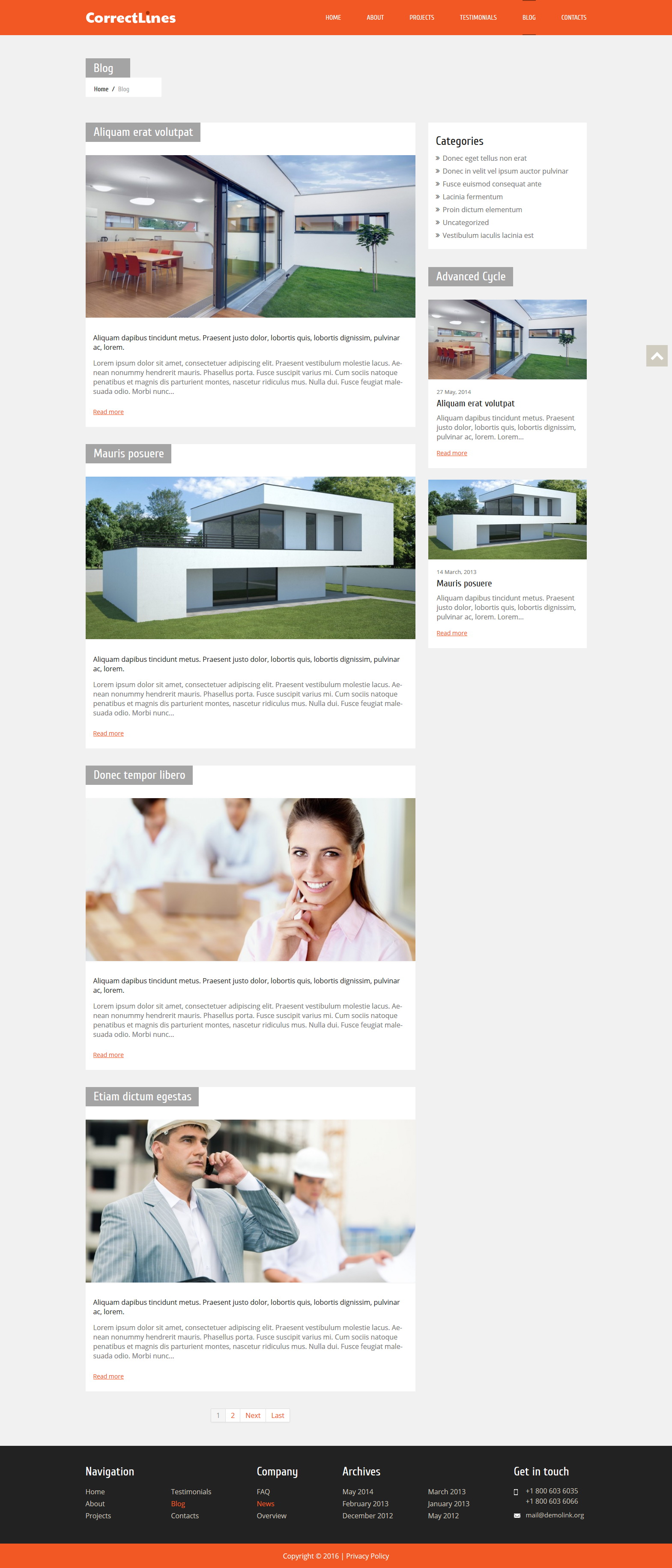
Blog (desktop)
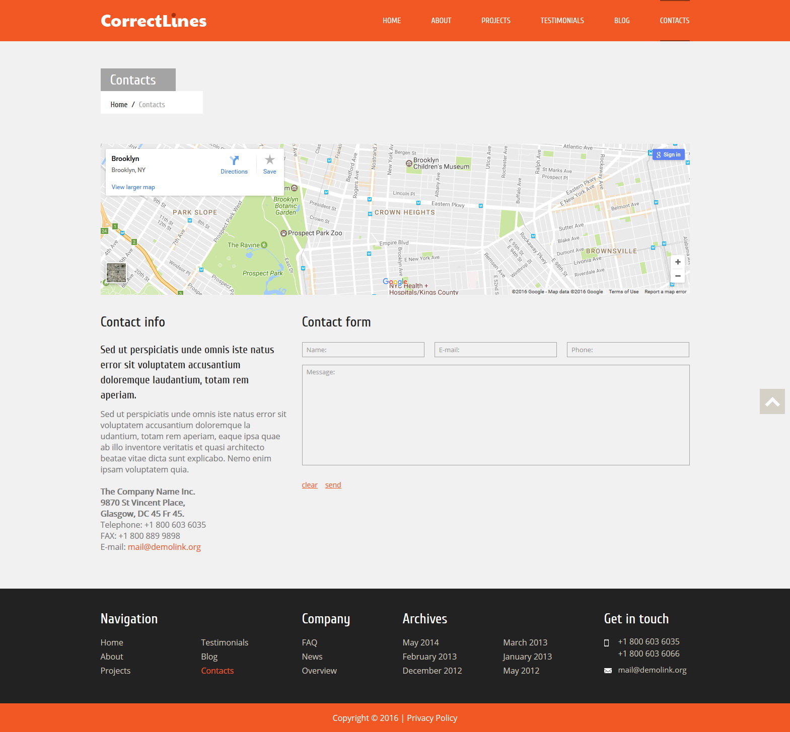
Contact Us (desktop)
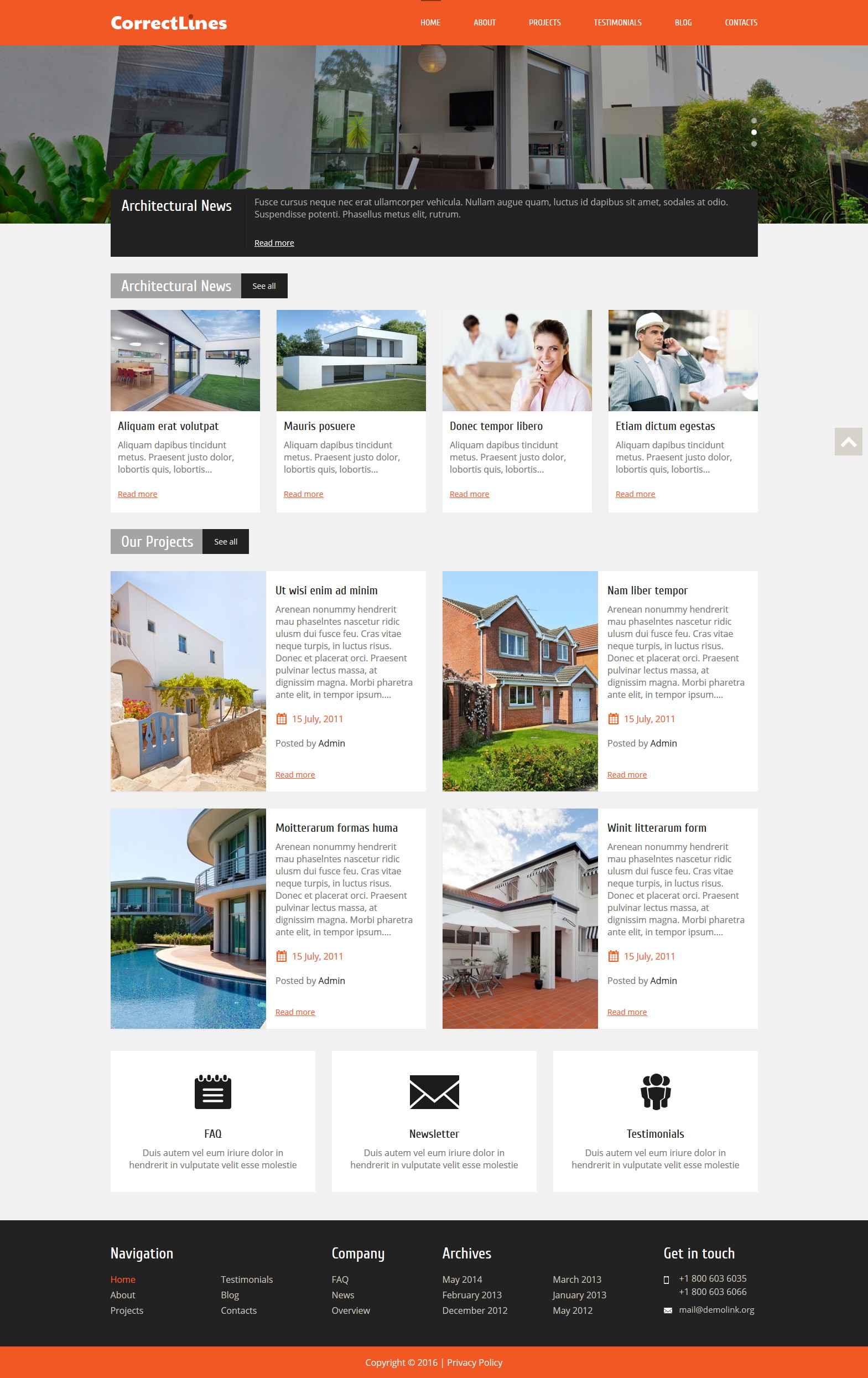
Home V1 (desktop)
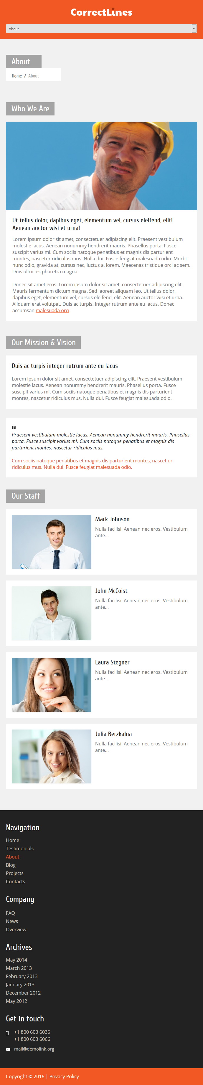
About Us (tablet)
Blog (tablet)
Contact Us (tablet)
Home V1 (tablet)
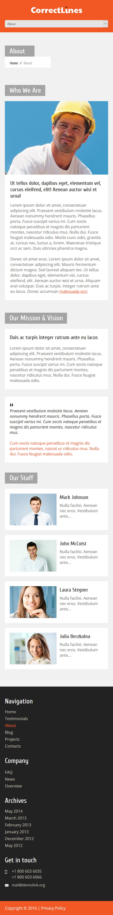
About Us (mobile)

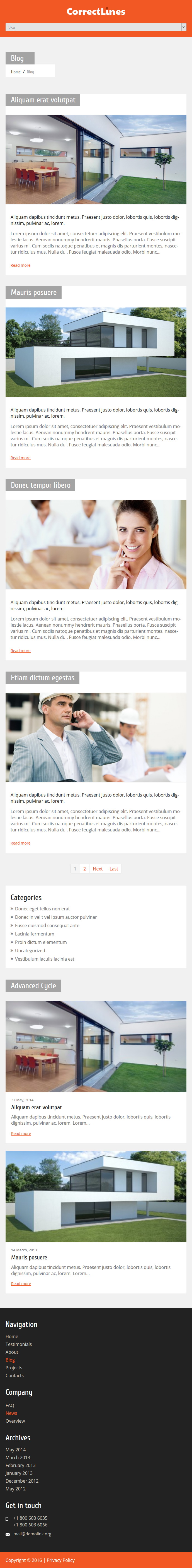
Blog (mobile)
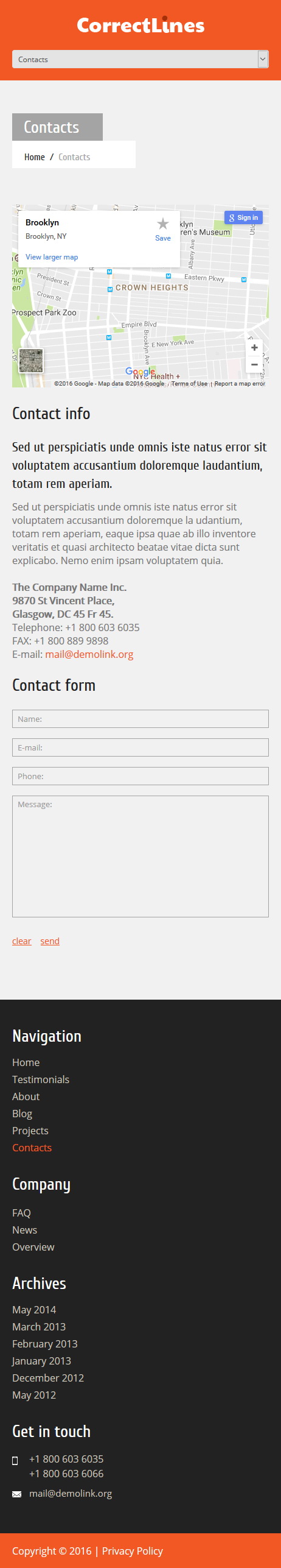
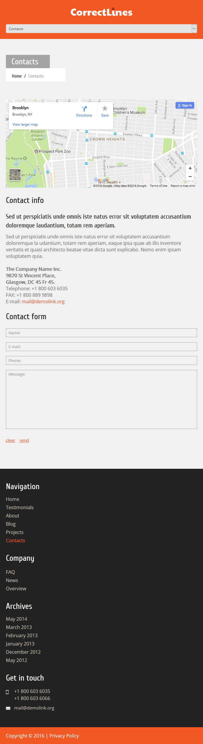
Contact Us (mobile)

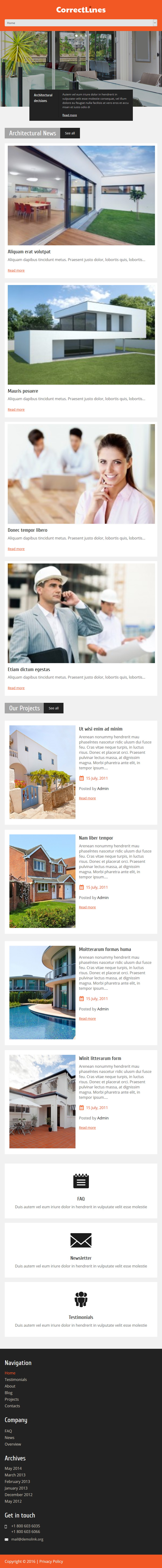
Home V1 (mobile)

WordPress Theme Installation / Wordpress Migration / Transfer / Cloning / Change Domain
Our Services as follows:
- WordPress Installation. Free
- Installation of Themeforest theme $49
- Installation of Templatemonster theme $39
- Adding plugins to WordPress $29
- Renaming menu $45
Coming soon...
Coming soon...